Typically when a client reaches out for our window treatment design services they are partially through their design journey. Paint colors are set, furniture may have been purchased and they are looking to pull it all together with their window treatments.
Such is the case with one of our current projects in process in Moore, Oklahoma.
Before our meeting, we send out a preliminary survey to help identify our target style and color palette. Ms. W came back with a clear vision towards floral prints and a love of pink! Based upon her selections, we choose a starter grouping of fabric books to bring when we reviewed her space at our onsite meeting.
At our initially meeting, Ms. W had already chosen some chairs for the master sitting room, a duvet and love seat for the master bedroom, and had a sentimental piece of art work from her grandmother that she wanted to use in the master bath.
After discussing her needs and going through some options, she fell in love with this old fashioned floral print, which was a great combination of the pinks and reds she loved, and the yellow beige wall color in her space. Here it is next to that artwork and love seat.
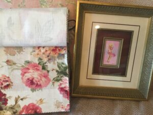
Since the sitting room offers a great view, and not much wall space, she wanted her draperies to be the center of attention in this space, and so we decided this floral fabric was best placed in this room in her master suite.
We left the meeting with the understanding that our client loves:
- Color
- Pattern
- Trim
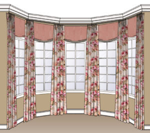
Our job was to find fabrics and trims, and come up with designs that help pull the eye upward, and fill some of the empty space between the windows and the ceiling line.
Here are the designs and fabrics that we presented at our follow up meeting.
Master Sitting: Adding a faux roman shade up close to the ceiling line in between each panel out of a complimentary pink linen softens the space and ties all the panels together as one cohesive treatment.
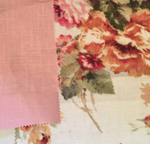
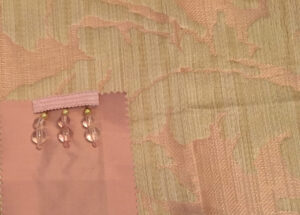
Master Bedroom: Since the sitting room is visible from the master bedroom, this treatment needed to be complimentary to, but not competing with, the powerful pattern in the master sitting area. A shaped cornice board mounted above the window in Anna French fabric with a blush colored silk dupioni and beaded trim fit the bill perfectly.
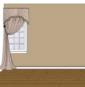
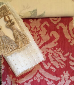
Master Bathroom: The client felt this space was blah, so we found a pink and white damask that looks a little bit like an old fashioned cross stitch, and paired it with a sweet old fashioned dotted semi sheer and some truly lux tassel trim.
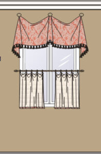
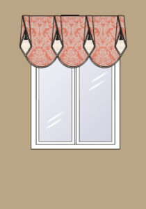
Although the client fell in love with all the fabrics, she and her husband felt like master bath window treatment design just didn’t quite suite them. So we pulled together a couple additional designs, and they felt like this one was the best fit for the space.
I can’t wait to see this project install in a few weeks. Look for photos on our main website just as soon as we can get it photographed.
